Fiserv partnered with Bow & Arrow to reimagine its website, and my role with Fiserv focused on design strategy and visual direction. Besides modernizing the website for seamless use across all devices, the aim was to be accessible, inclusive, and relevant for global audiences.
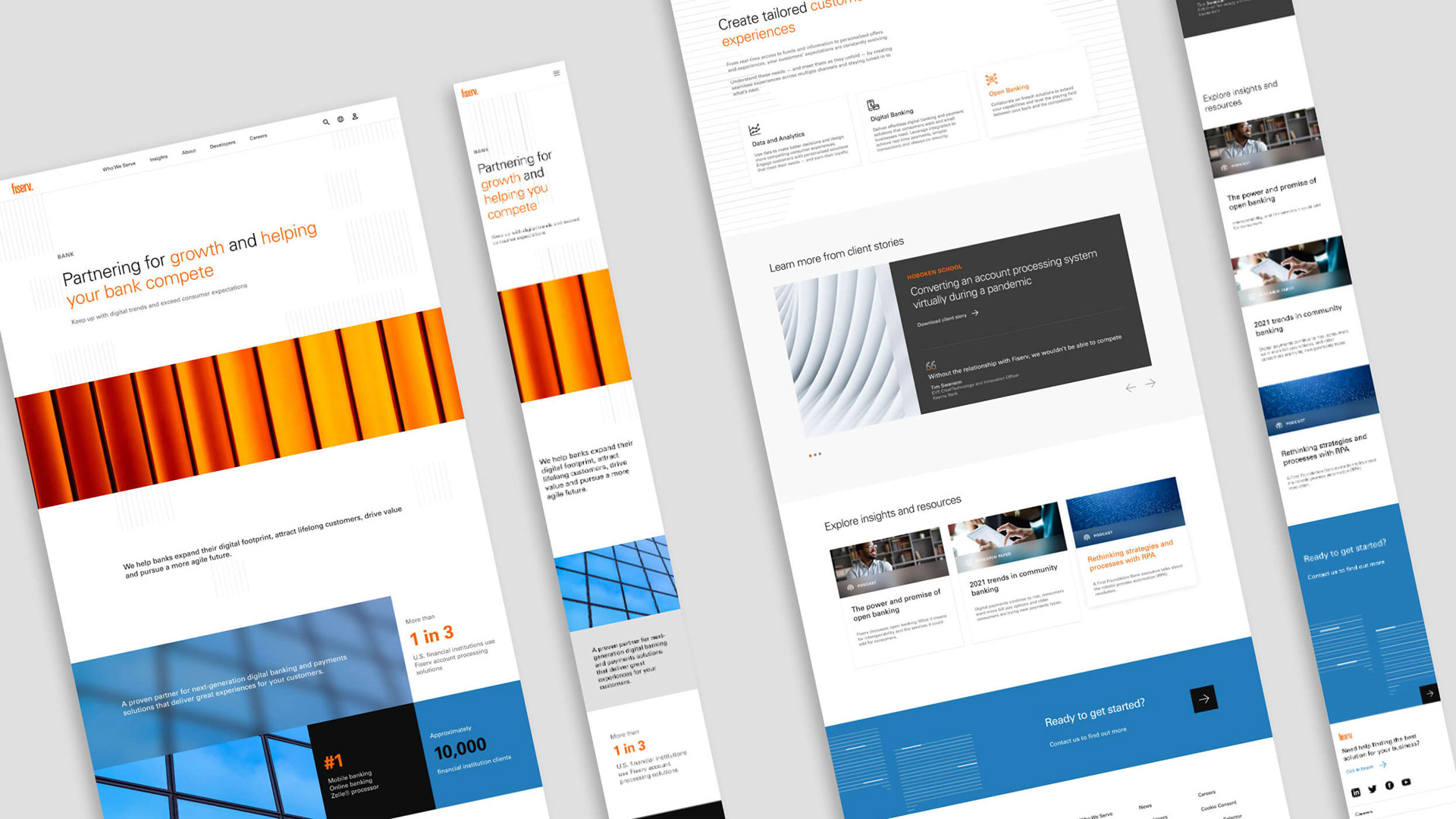
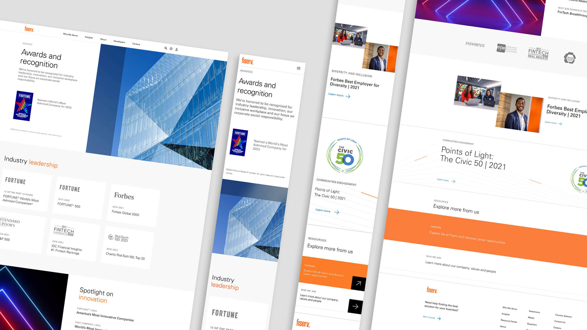
A new speedline illustration style is introduced for use throughout digital assets as background texture to spark visual interest, support content messaging, and reduce reliance on stock photography. The Fiserv color palette has been curated to an accessible digital experience – brand colors adjusted for better contrast and guidelines established for their appropriate use in text.
Micro-interactions provide visual cues that indicate UI response and demonstrate tactility of interaction. Additionally, lazy loading and parallax scrolling help users consume information at pace and add depth to content and assets, making the overall experience more engaging. Atomic design methodology was employed in the build and Figma made the magic happen.
Role: Creative Direction, Design
Agency: Bow & Arrow
Agency: Bow & Arrow
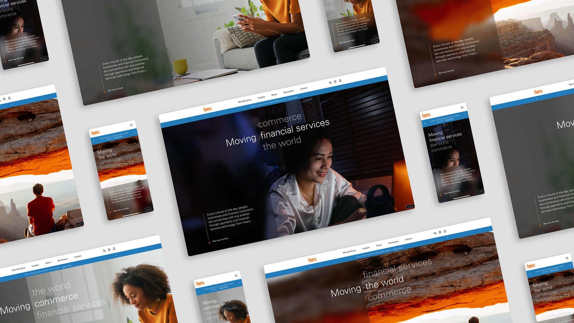
Homepage above the fold
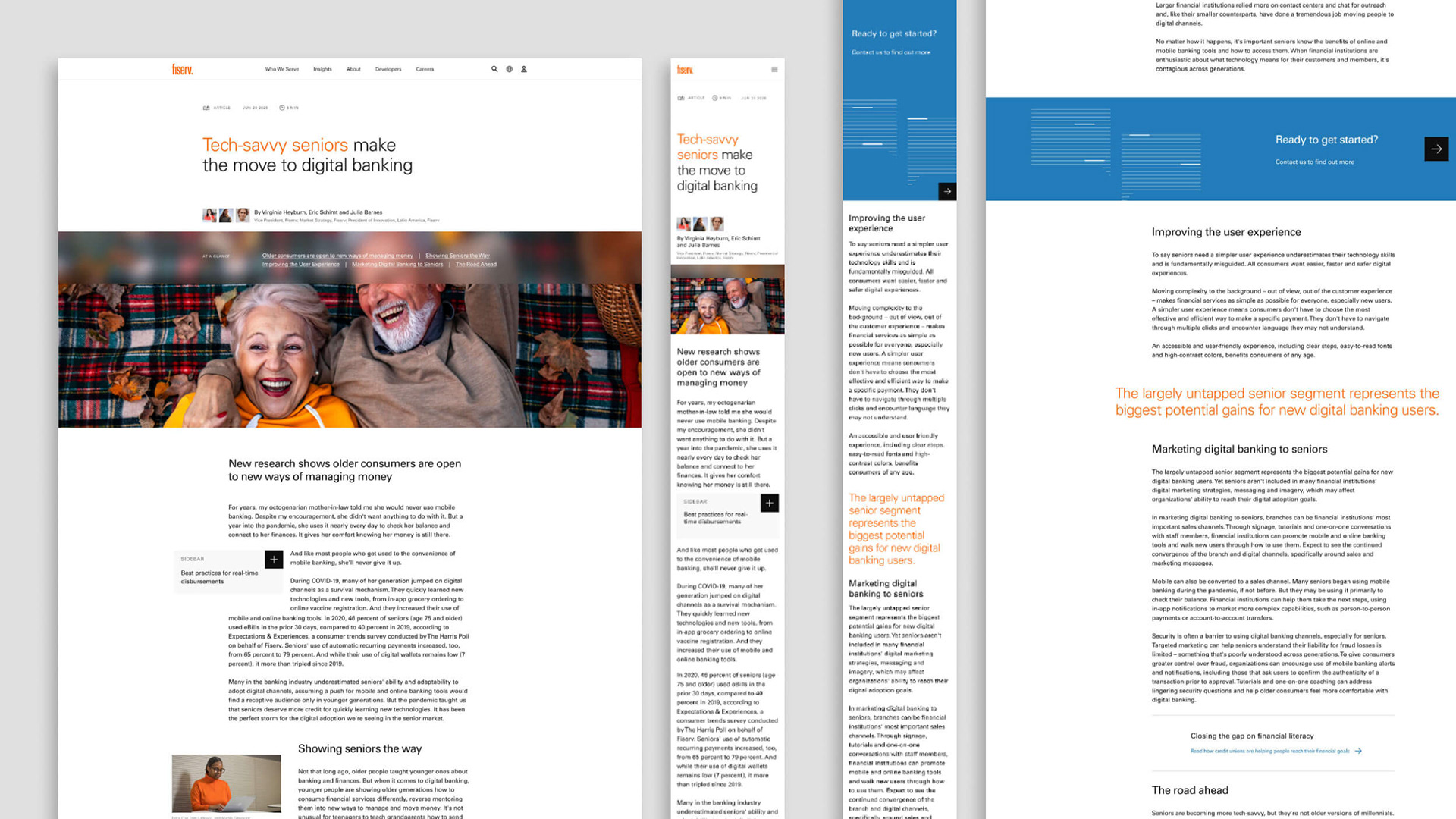
Homepage
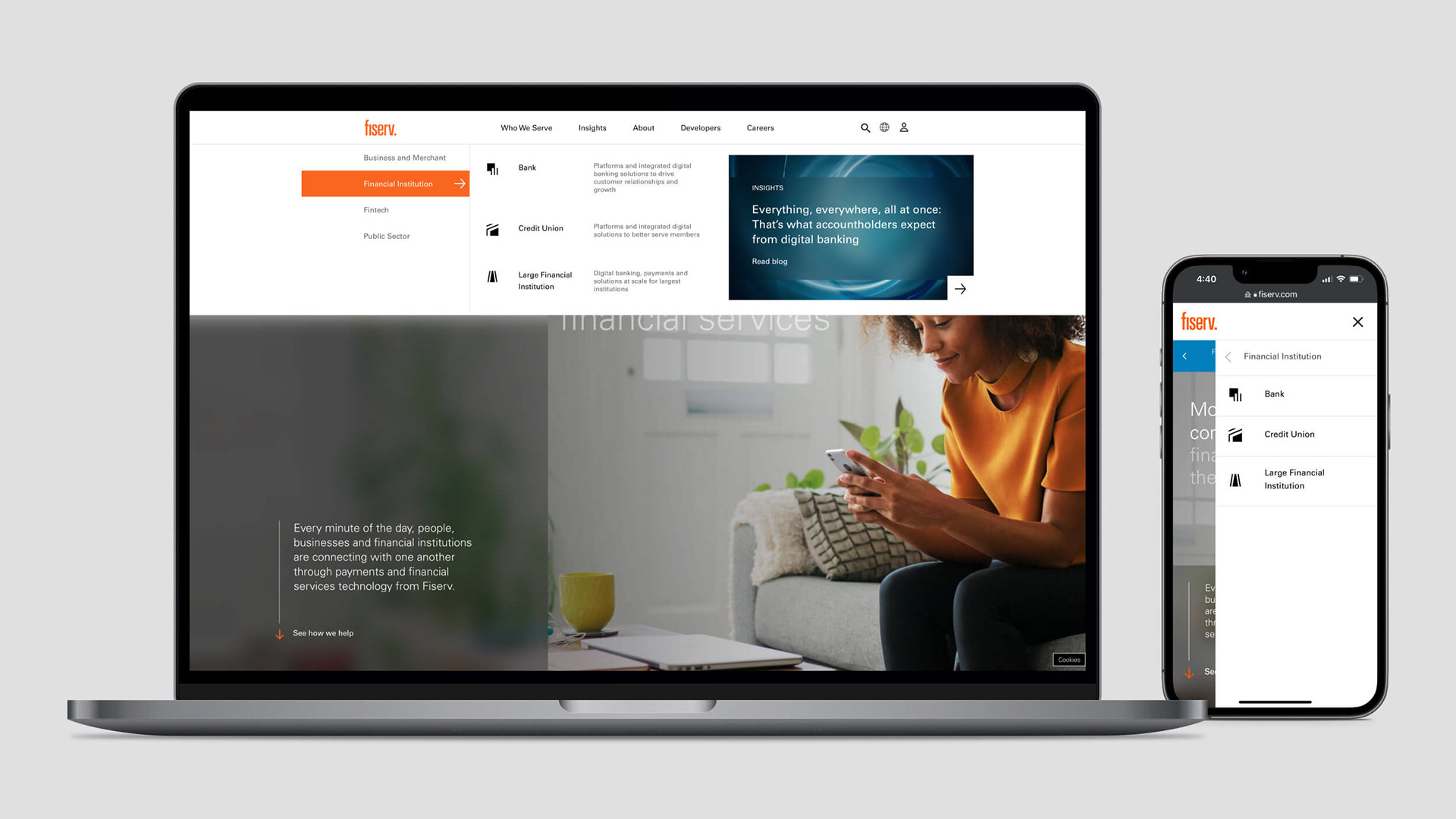
Top navigation
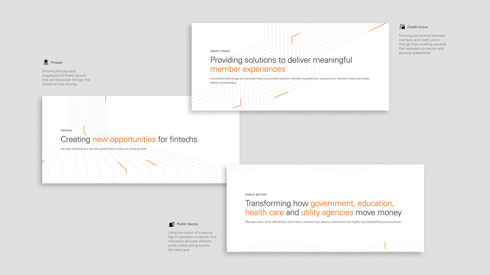
Segment icons + headers
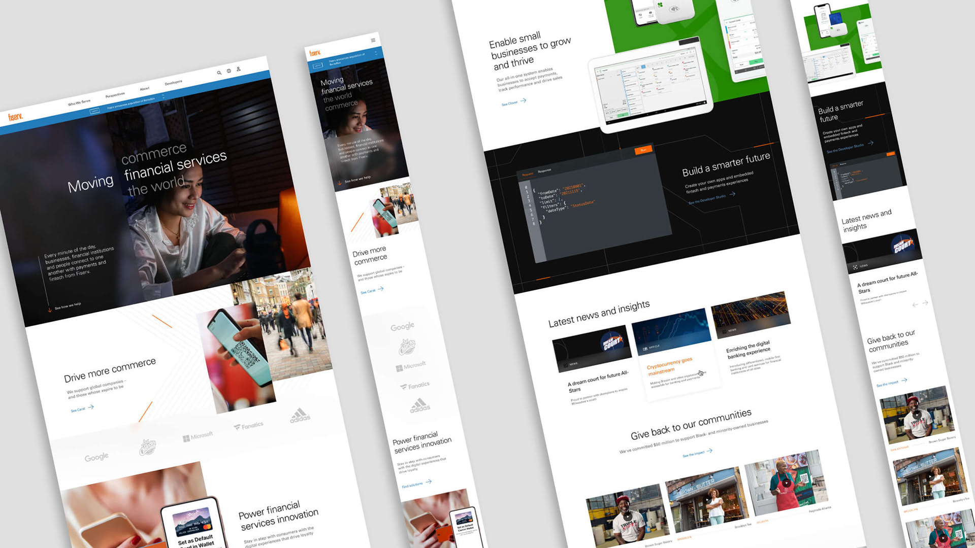
Segment page
Enterprise page
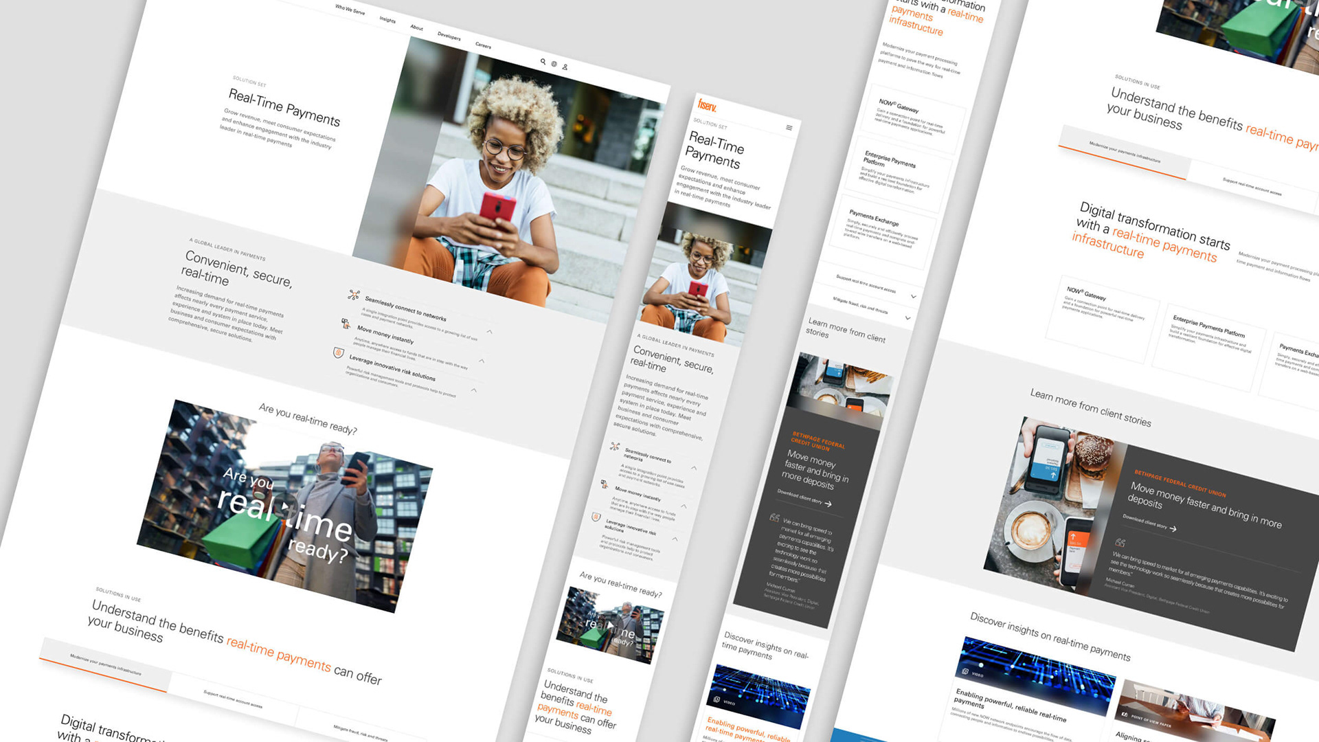
Solution Set page