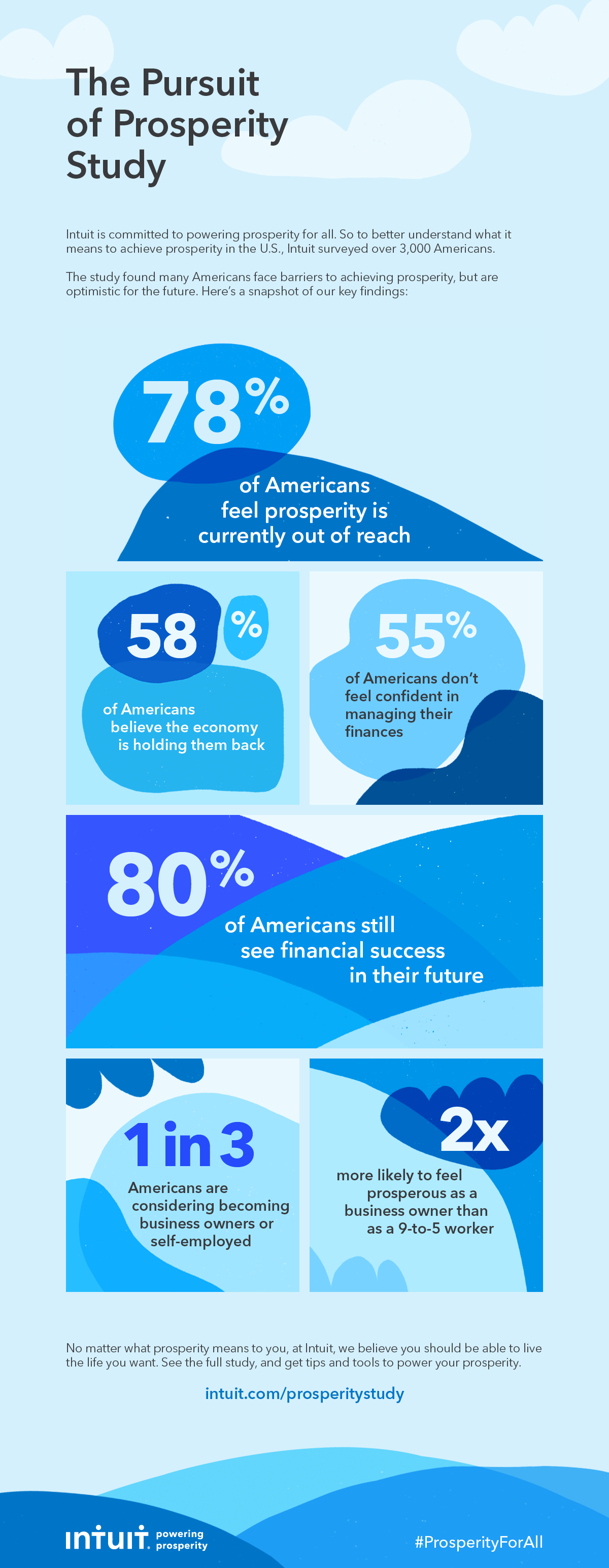
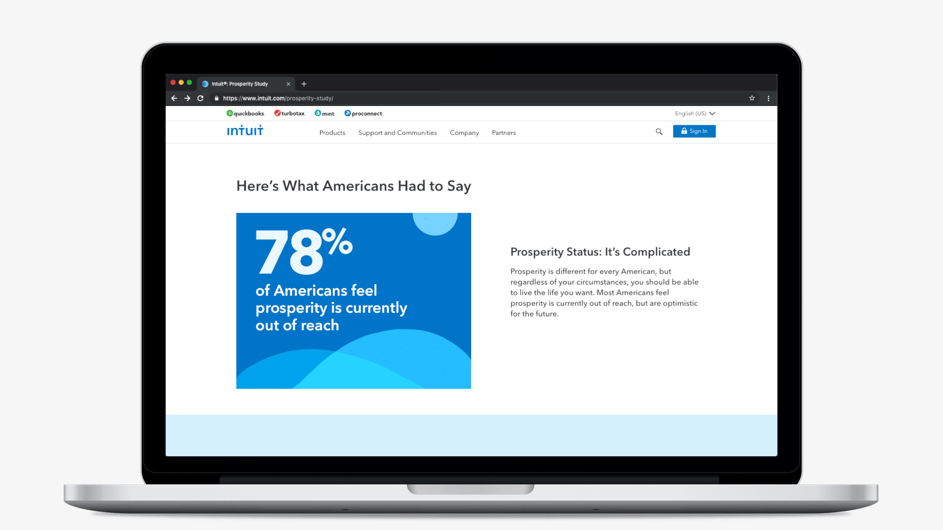
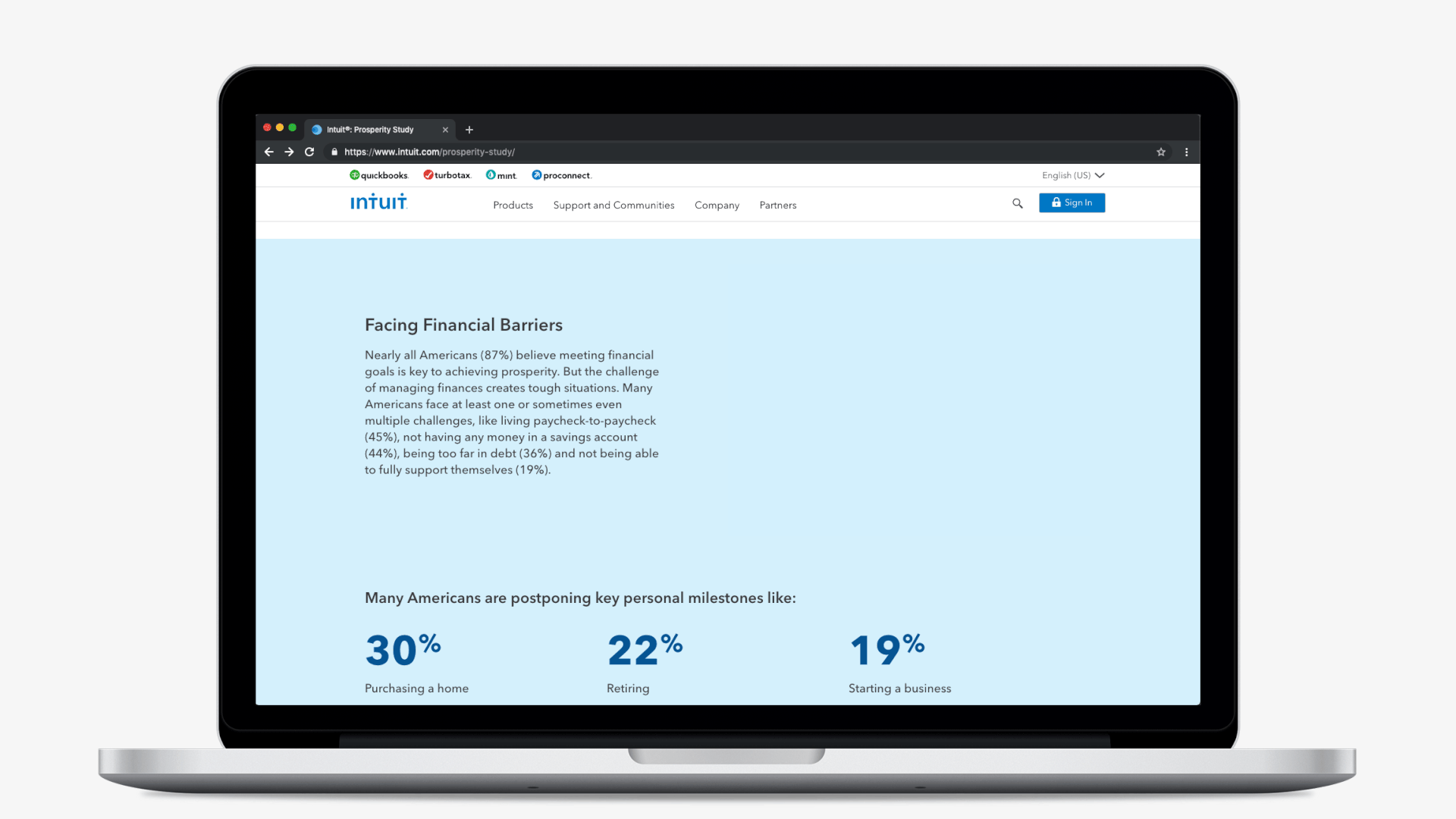
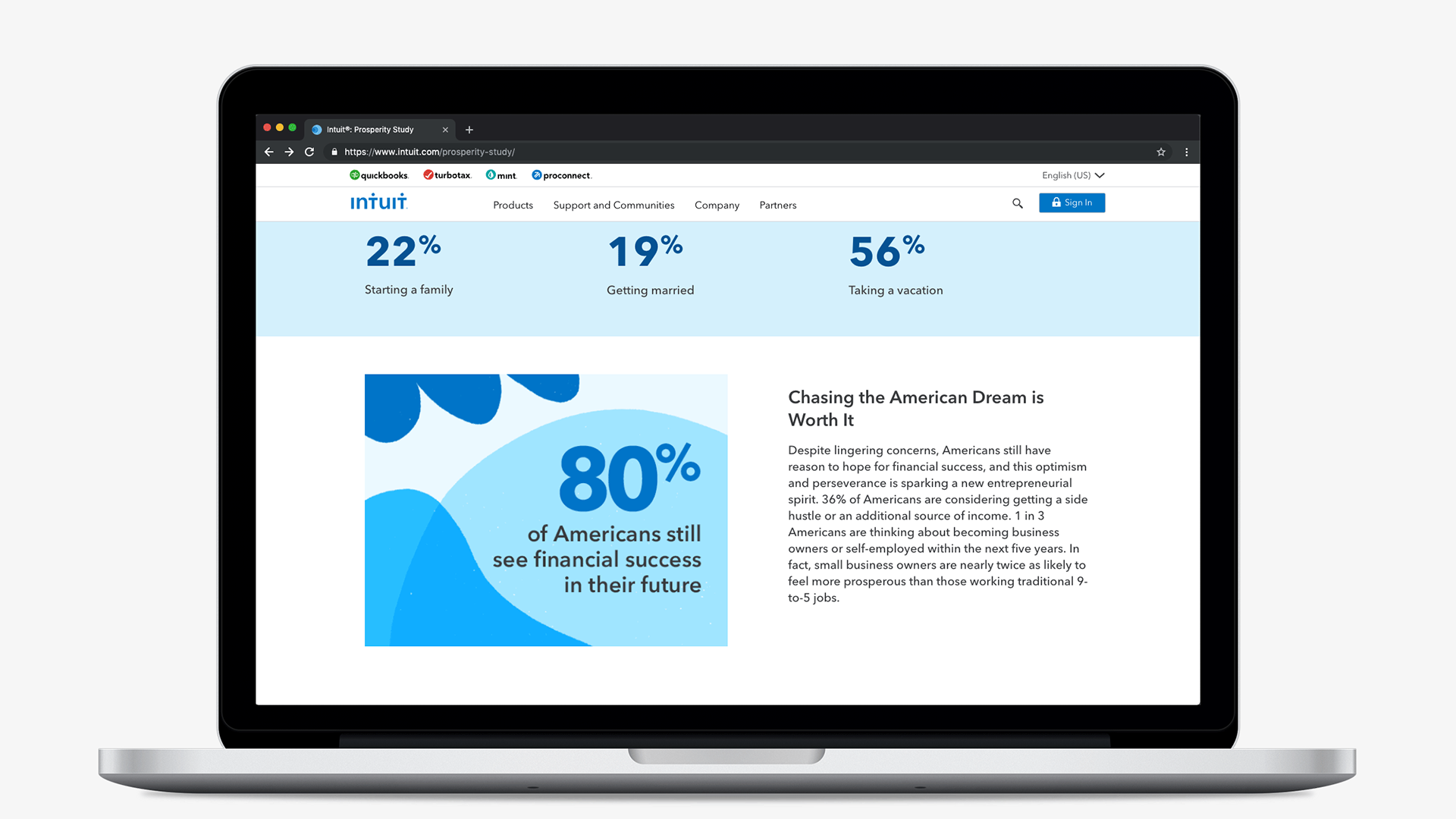
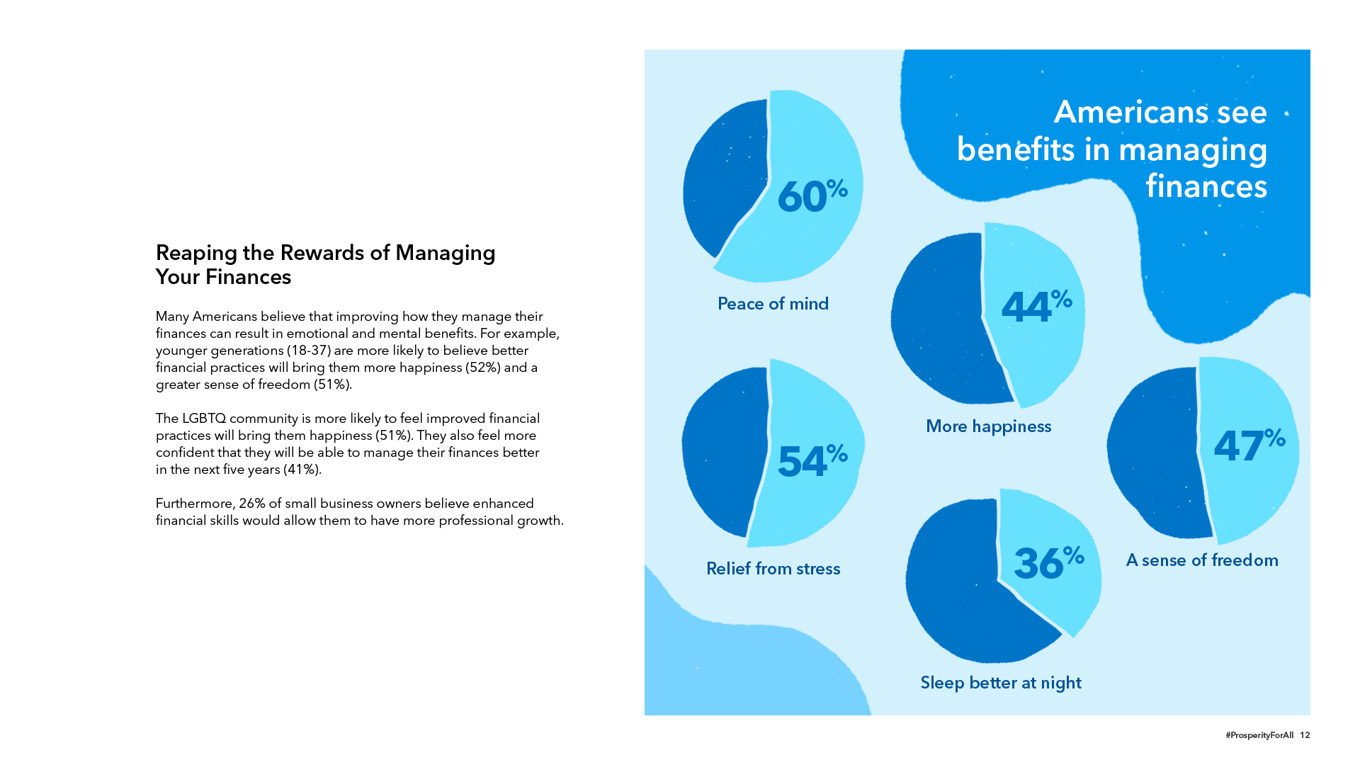
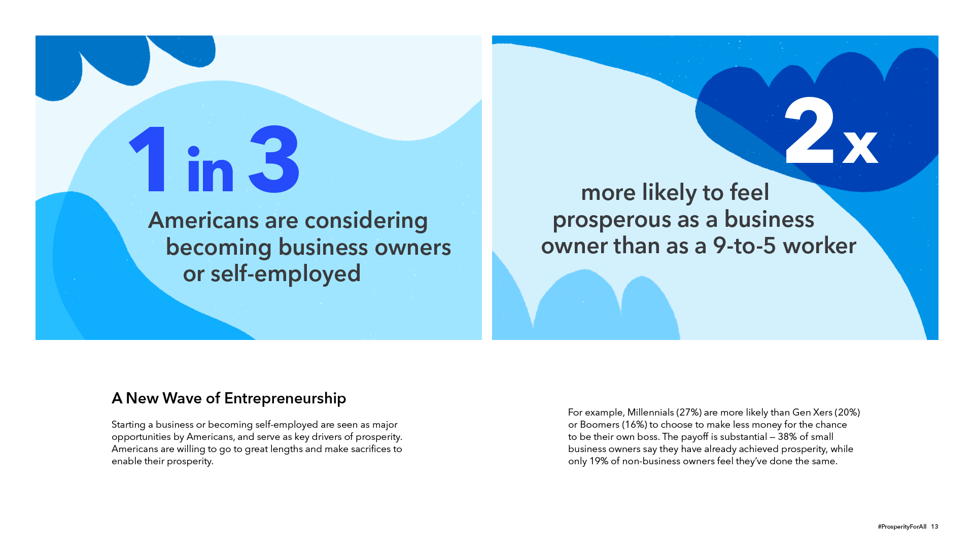
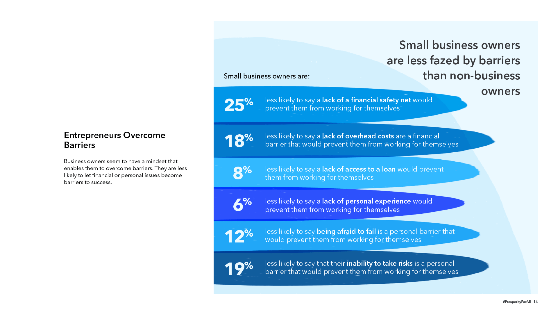
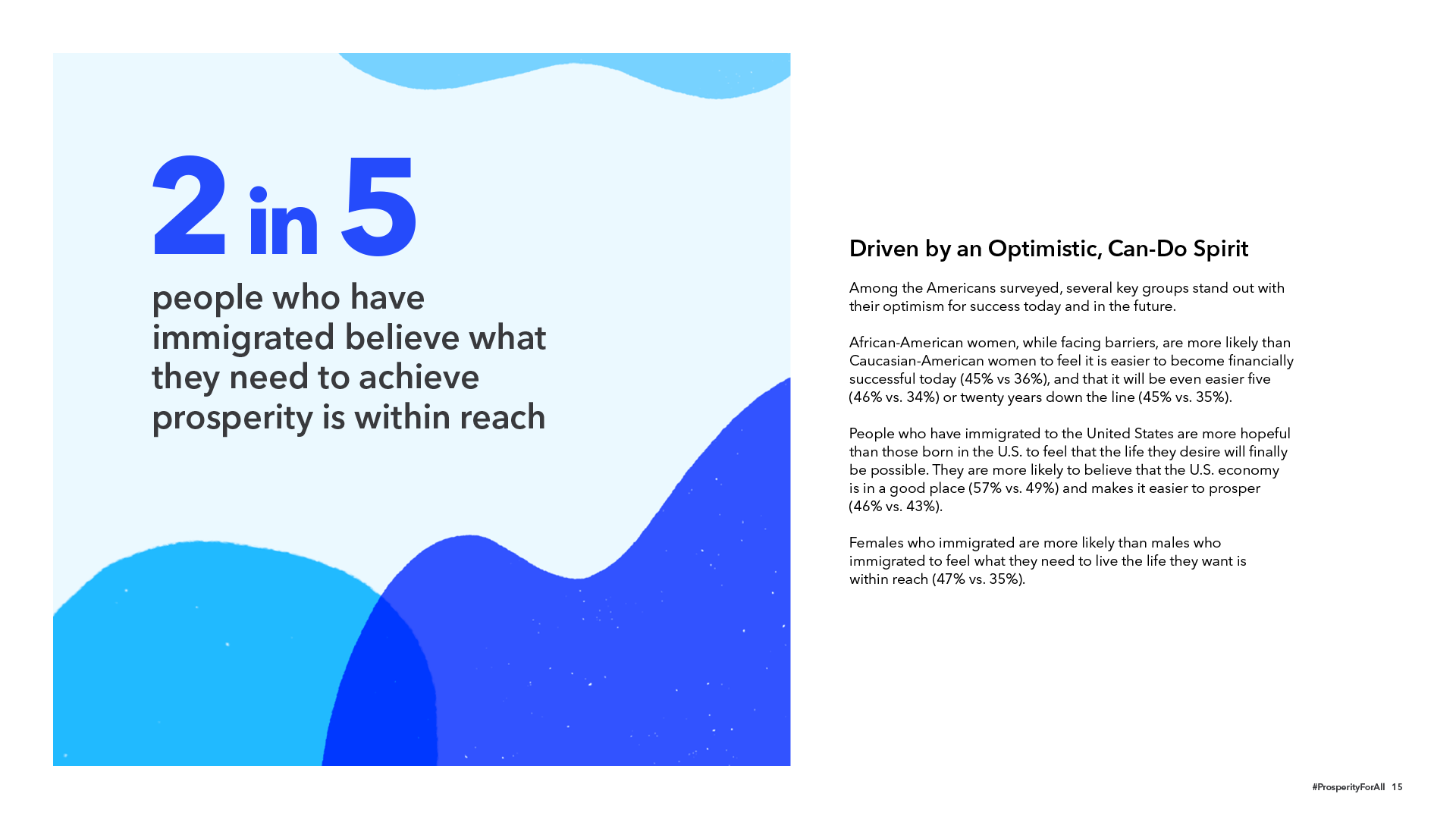
In partnership with Kelton Global, Intuit surveyed more than 3,000 Americans in an effort to better understand what prosperity means to them, the barriers they face, and their outlook on the future. The campaign's goal was to build brand awareness in America, and it was designed to add dimension to Intuit's mission of powering prosperity around the world, exploring consumers’ underlying beliefs and attitudes around prosperity, and making prosperity ownable to the Intuit brand.
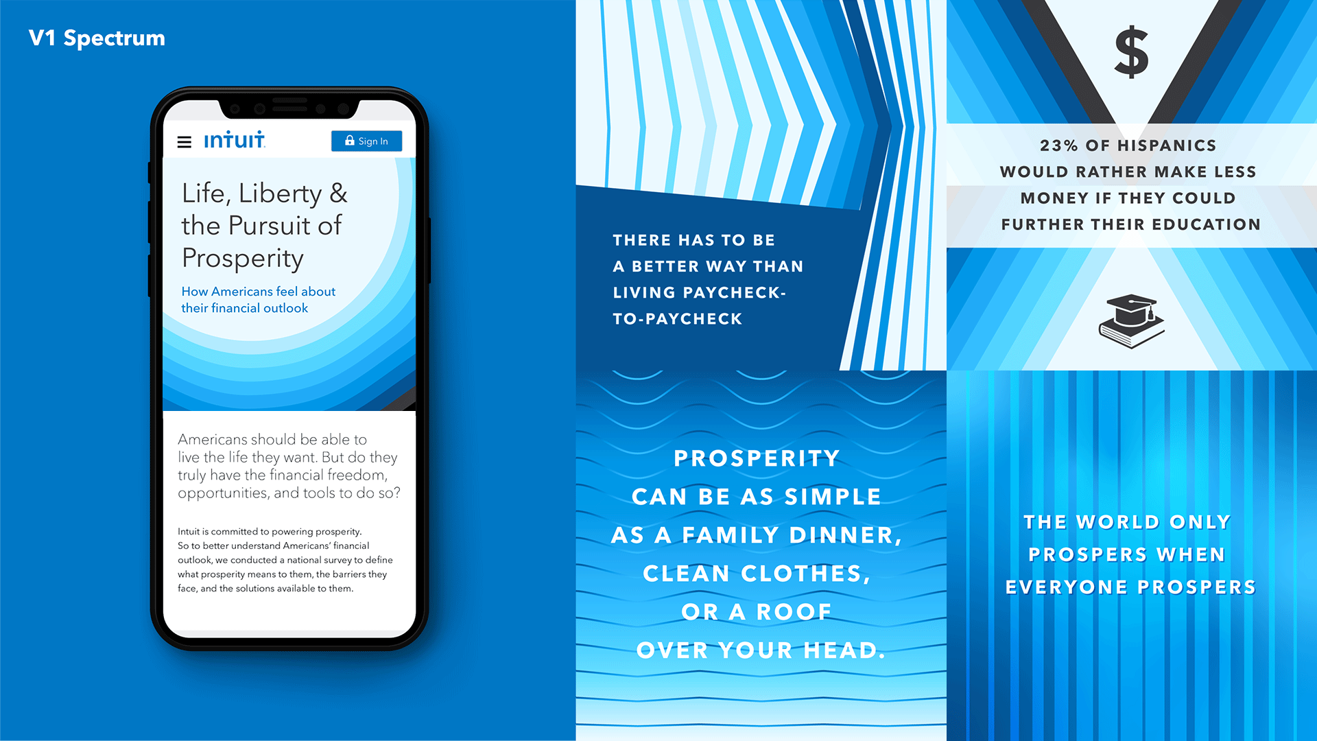
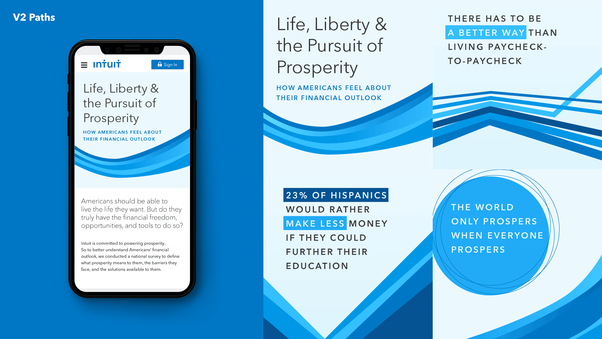
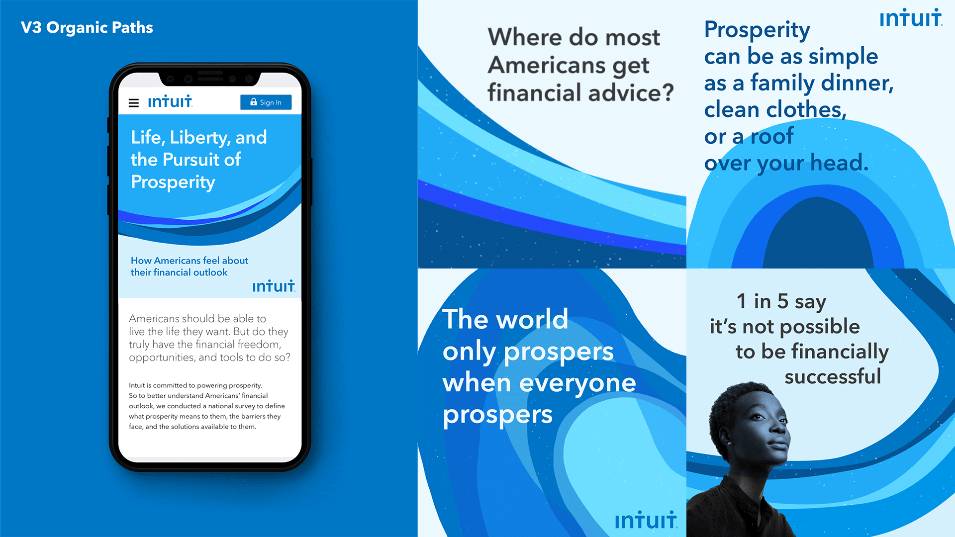
Initially, five concepts were presented. Of those, three were further developed before a final direction was selected. Tonality was ownable to Intuit, casual, optimistic, modern, forward-thinking, intelligent, approachable, bright, and fun. Once the Style Guide was developed, I used to build additional requested components – the Website, Full Study, and Infographic.
Role: Creative Direction, Design
Creative Team: Tiffany Pan, Murphy O'Brien
Creative Team: Tiffany Pan, Murphy O'Brien
Creative Exploration
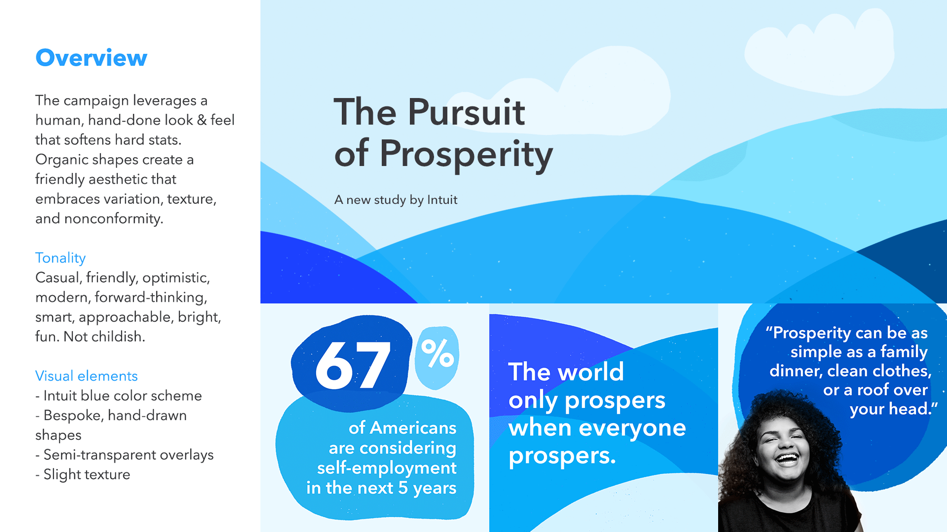
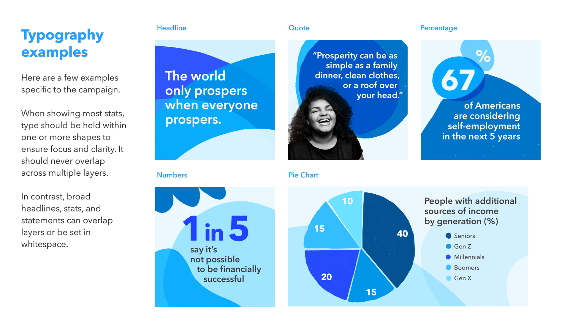
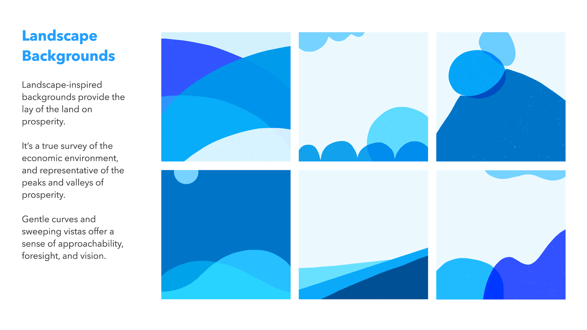
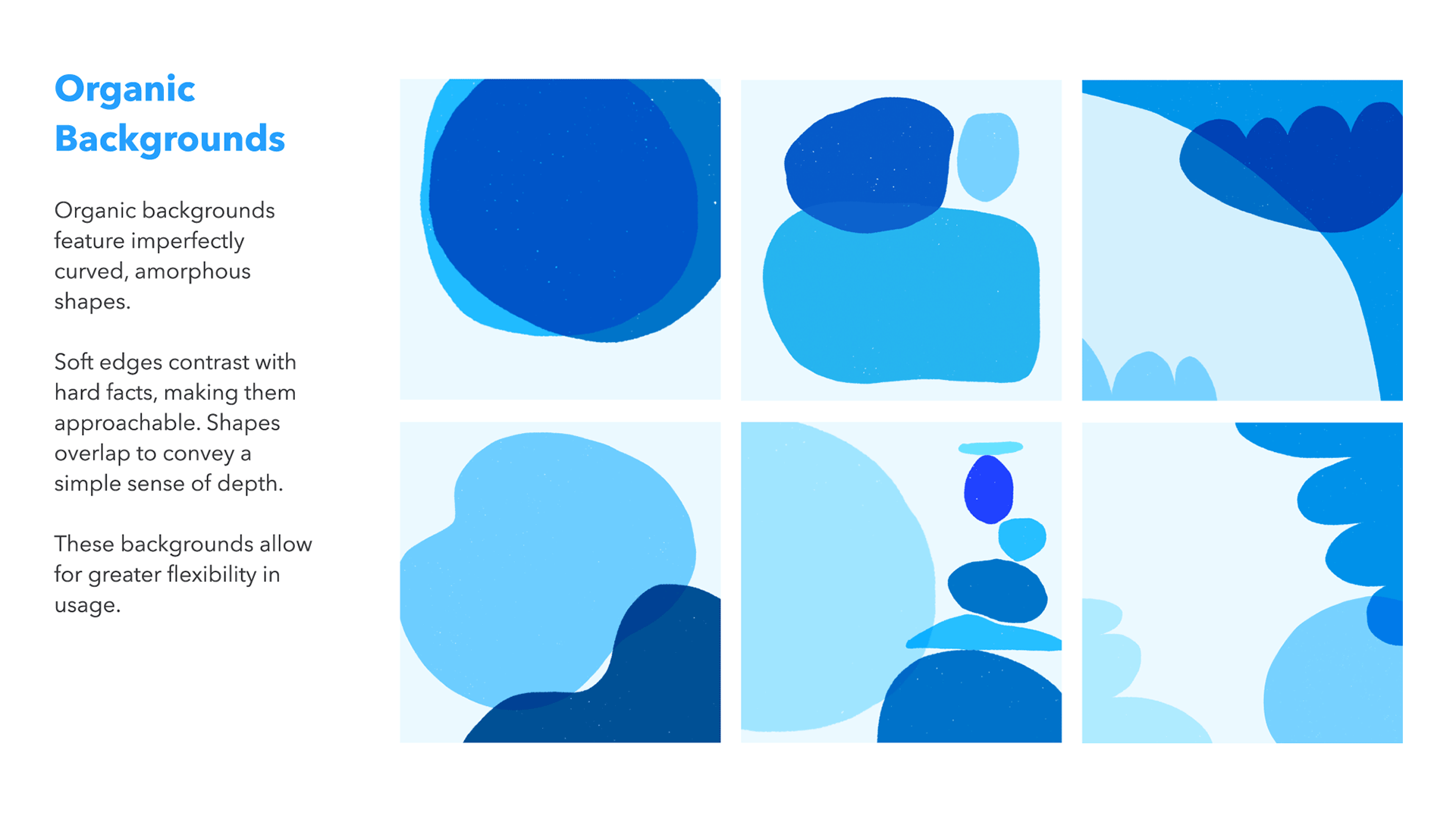
Some of my explorations: The first round depicted the spectrum of prosperity across America. Keeping the colors and gradients of Spectrum, Paths shifted focus to one's journey to get there, illustrating inclusiveness and the differences between key segments. The final direction, Organic Paths, used hand-drawn shapes to create a friendly aesthetic, embracing variation, texture, and non-conformity. Hard stats were softened with a more human, hand-done approach.
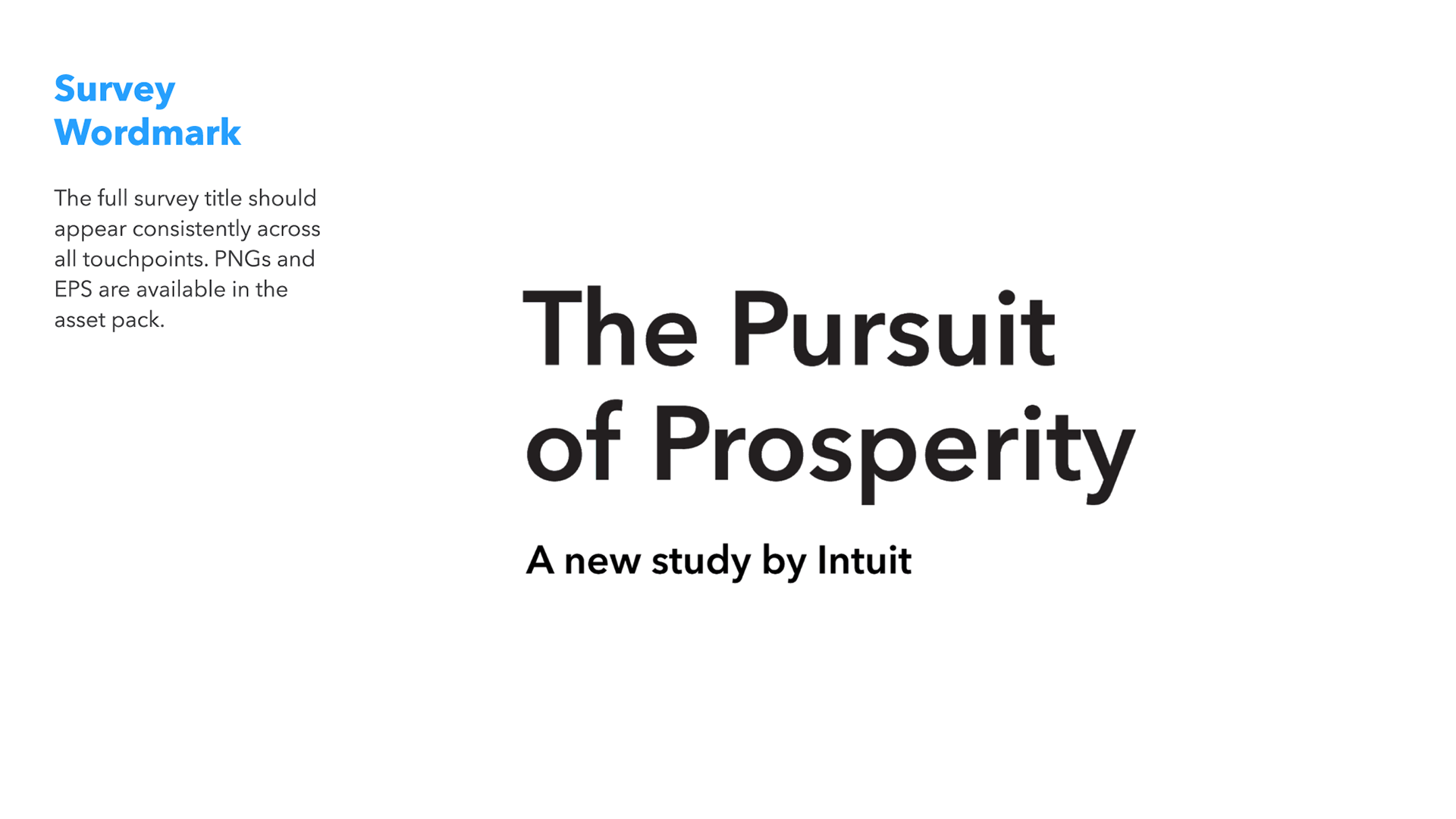
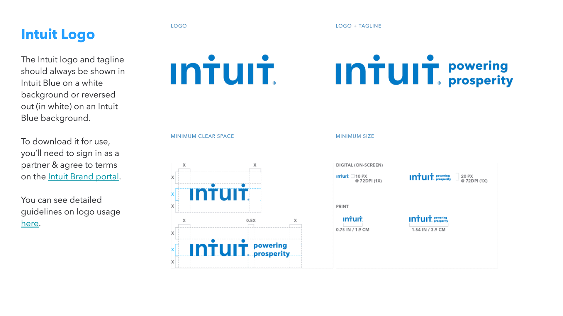
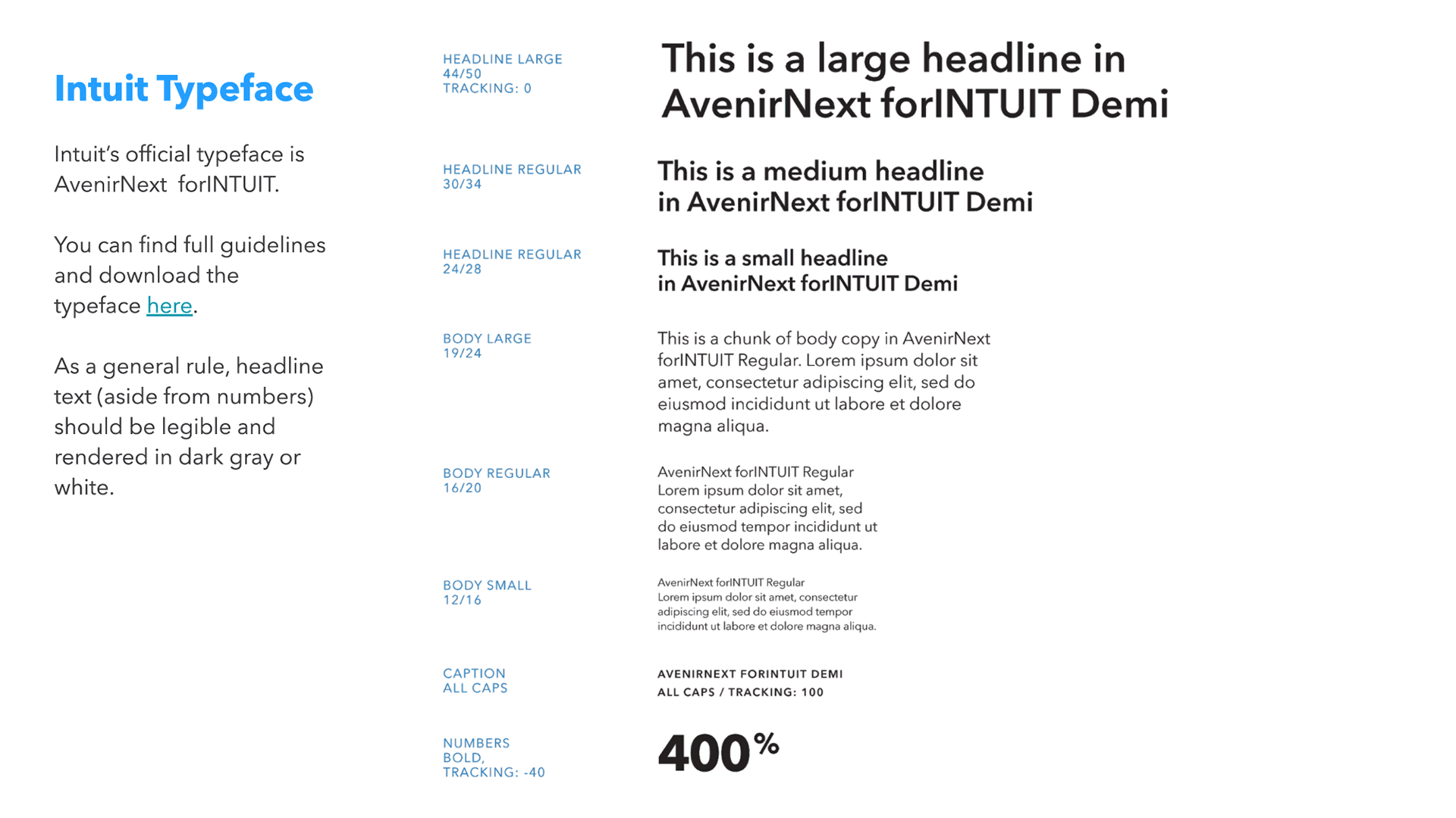
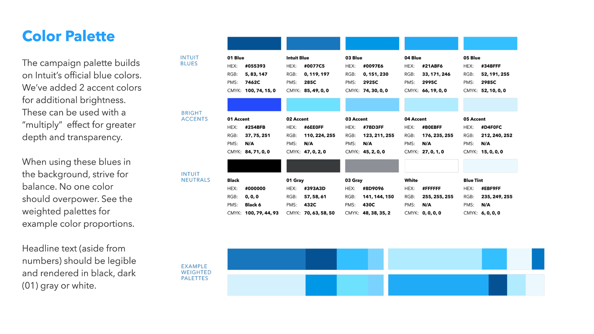
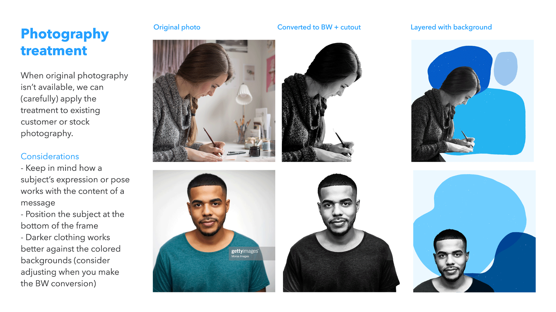
Style Guide
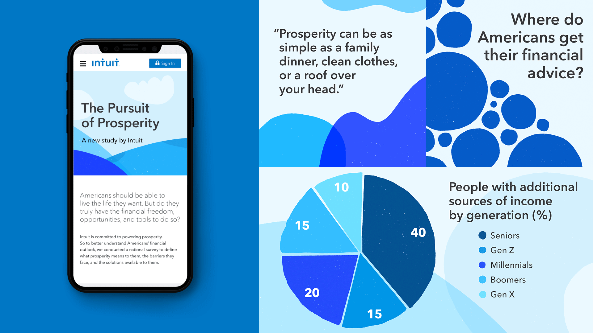
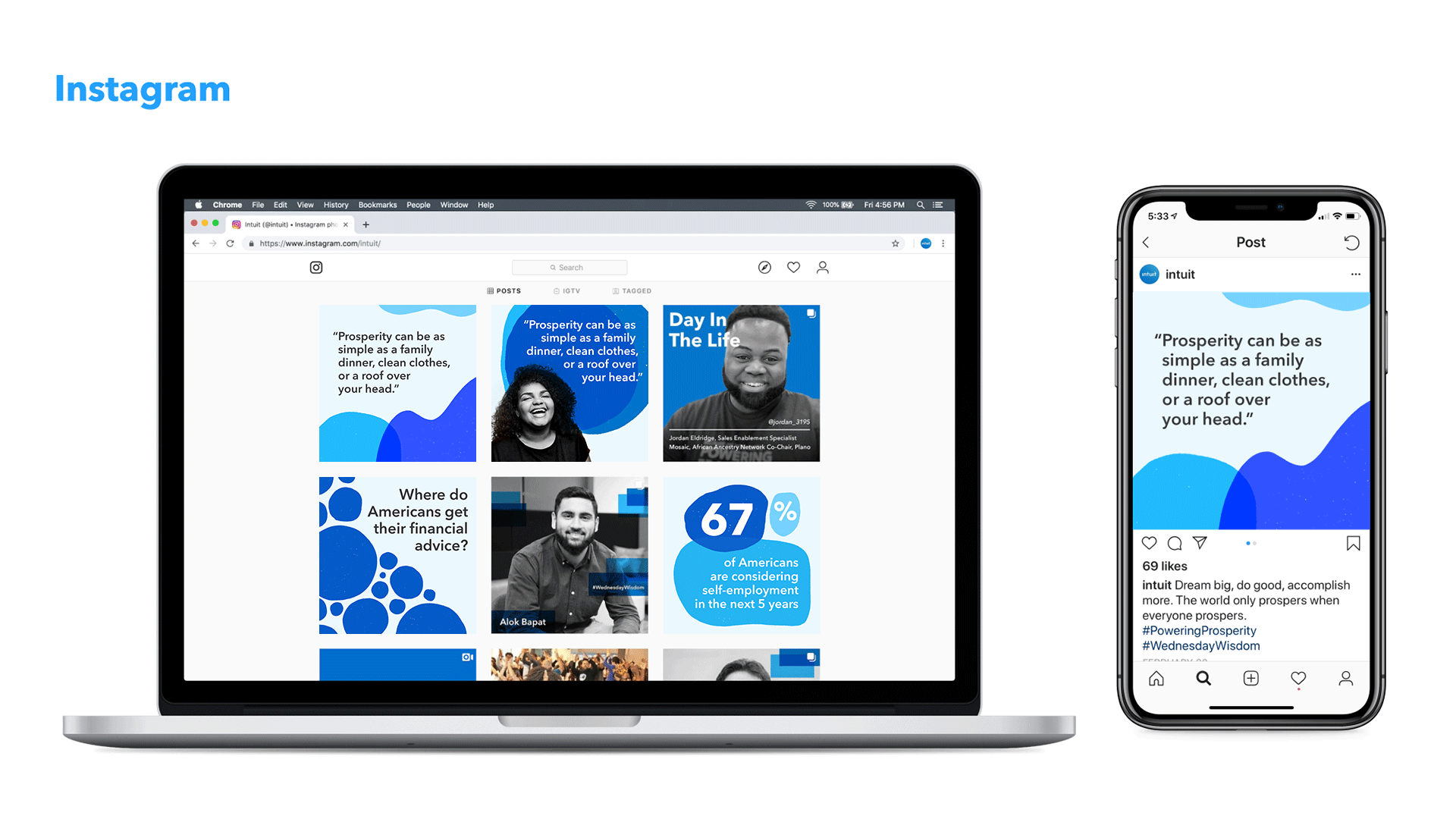
Created for strategic partners to use when building supporting graphics for social channels, press releases, and videos.
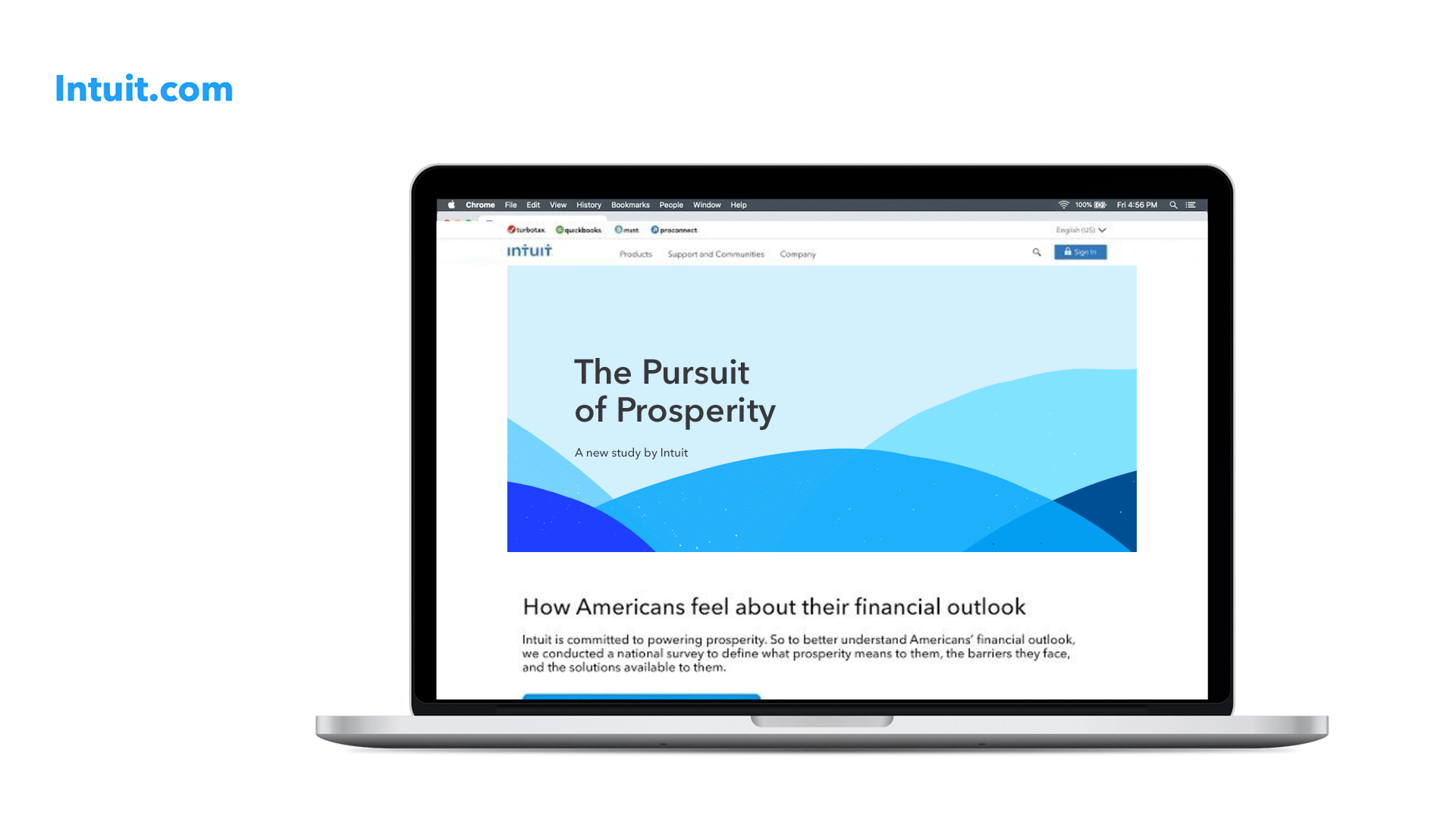


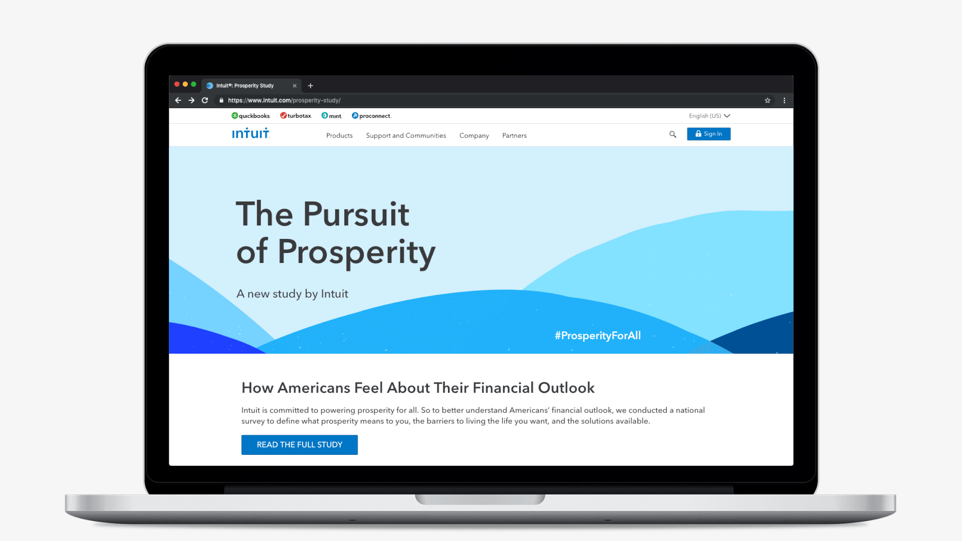
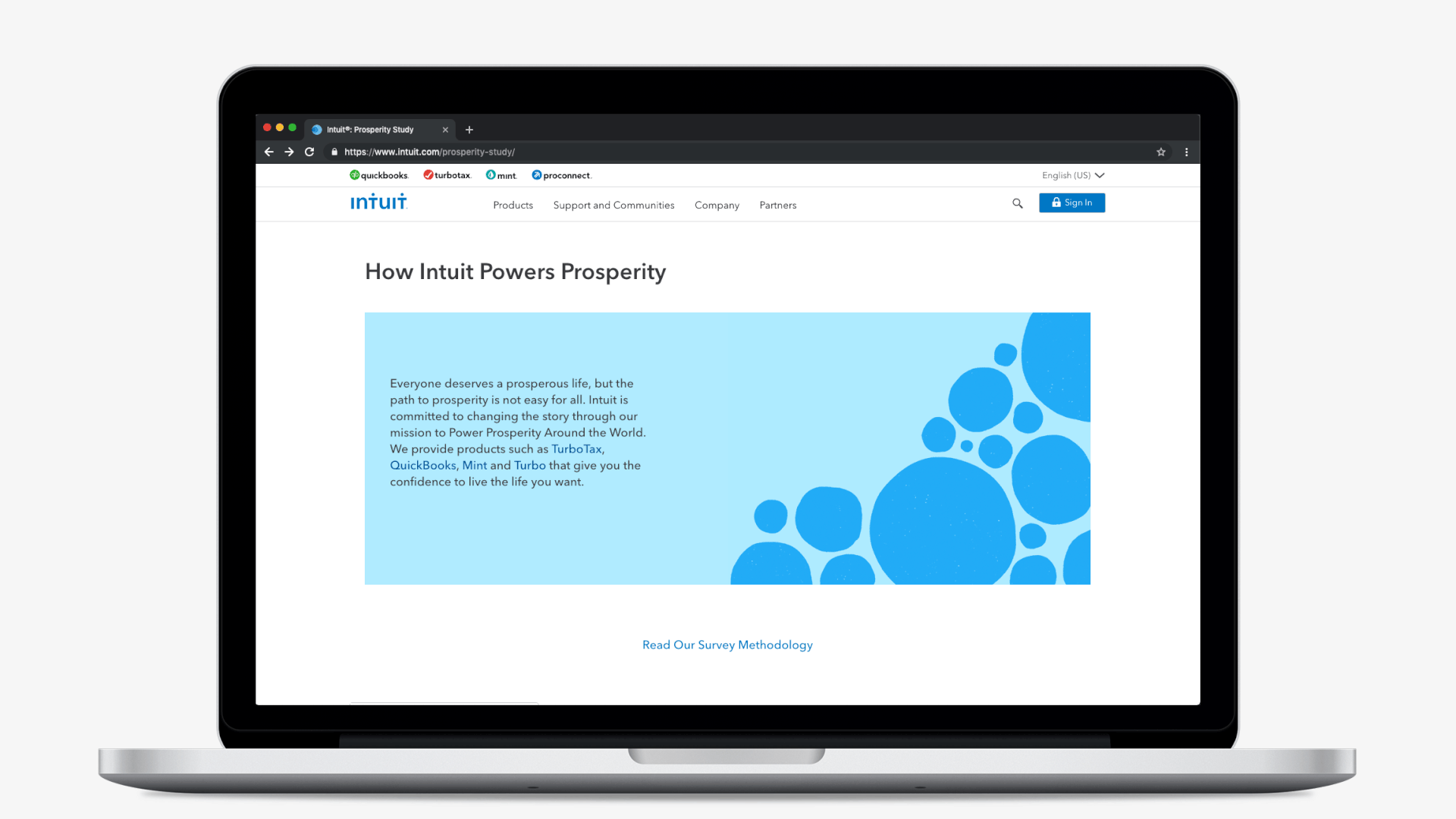
Prosperity Study Website
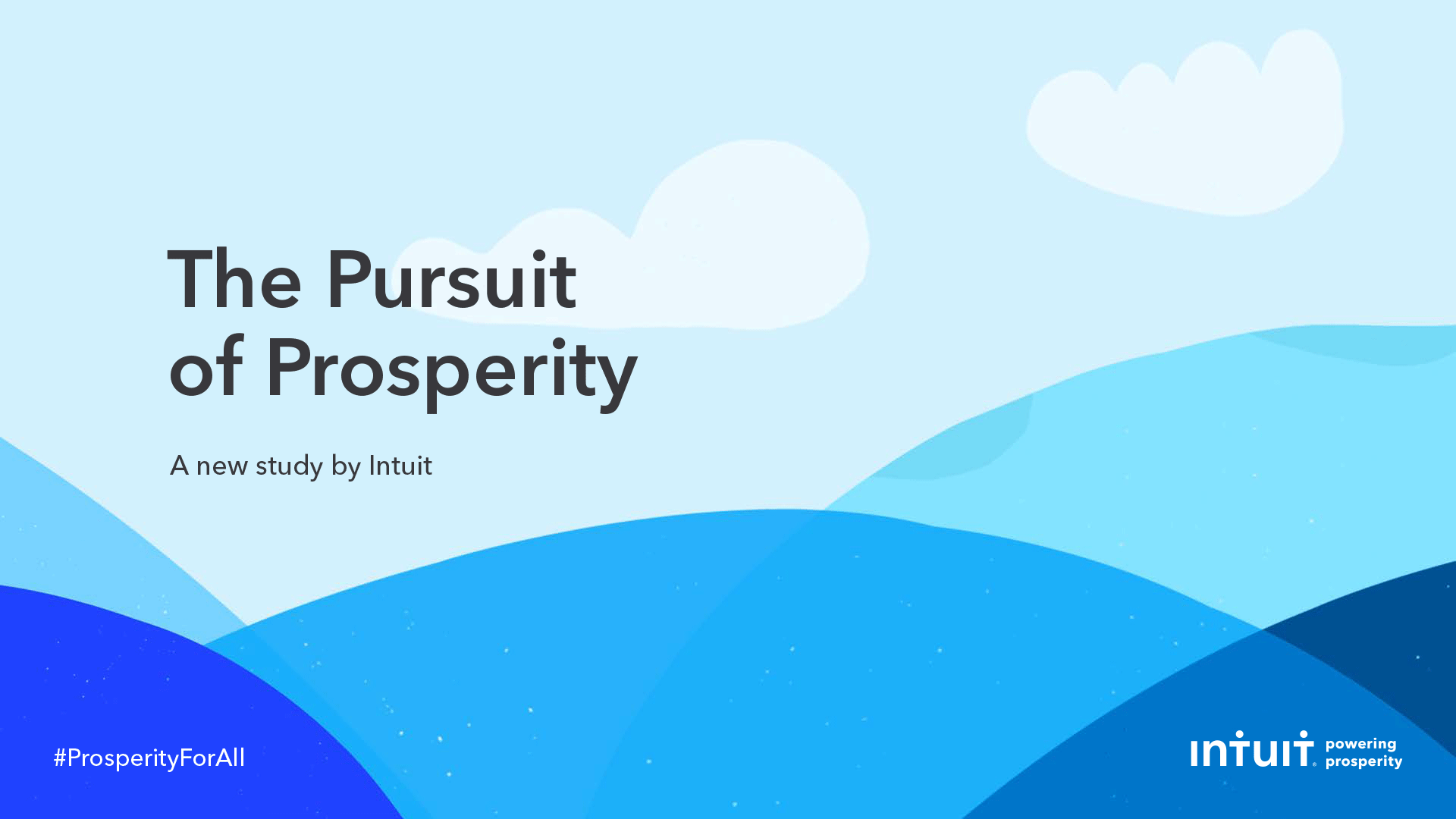
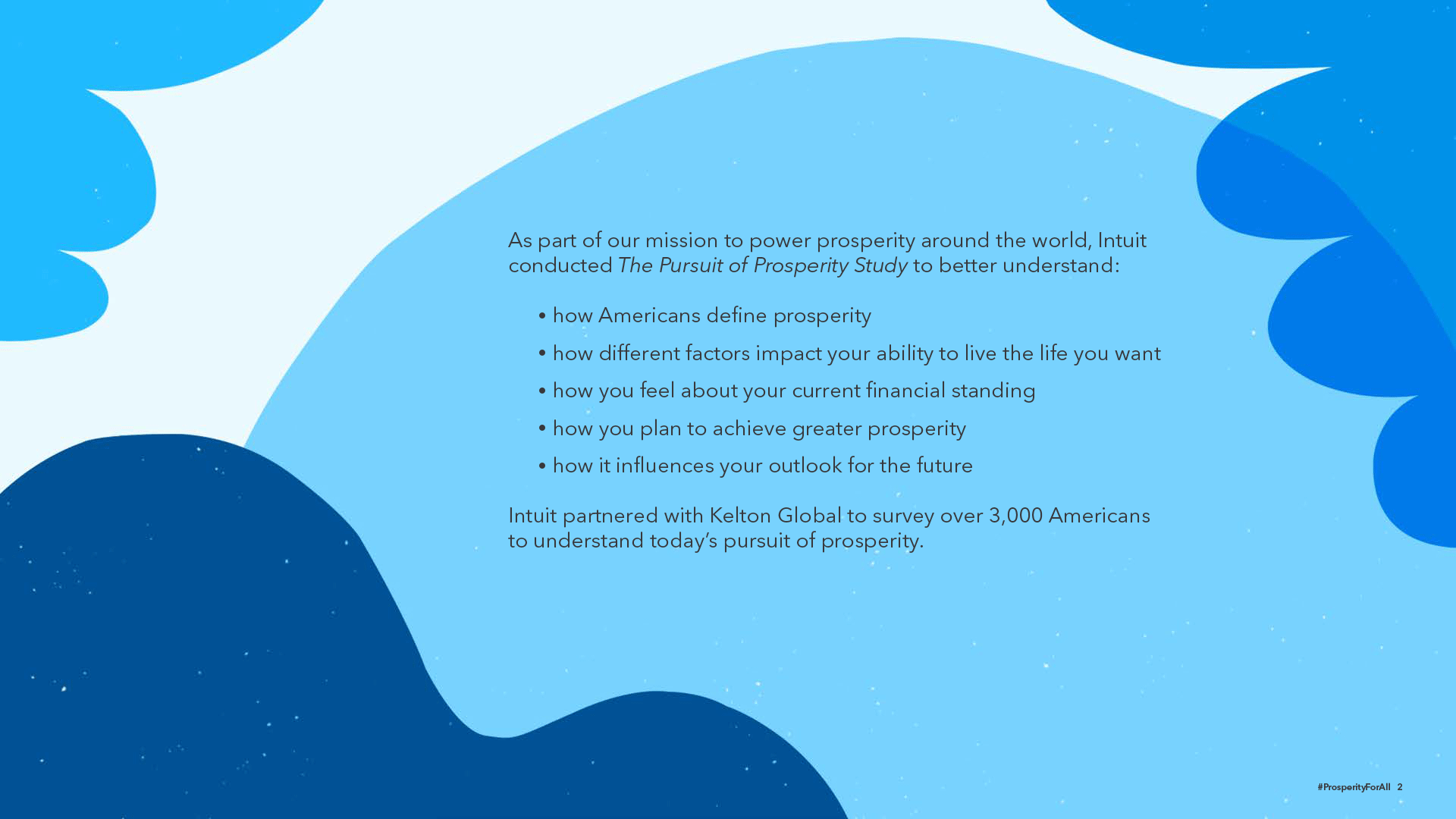
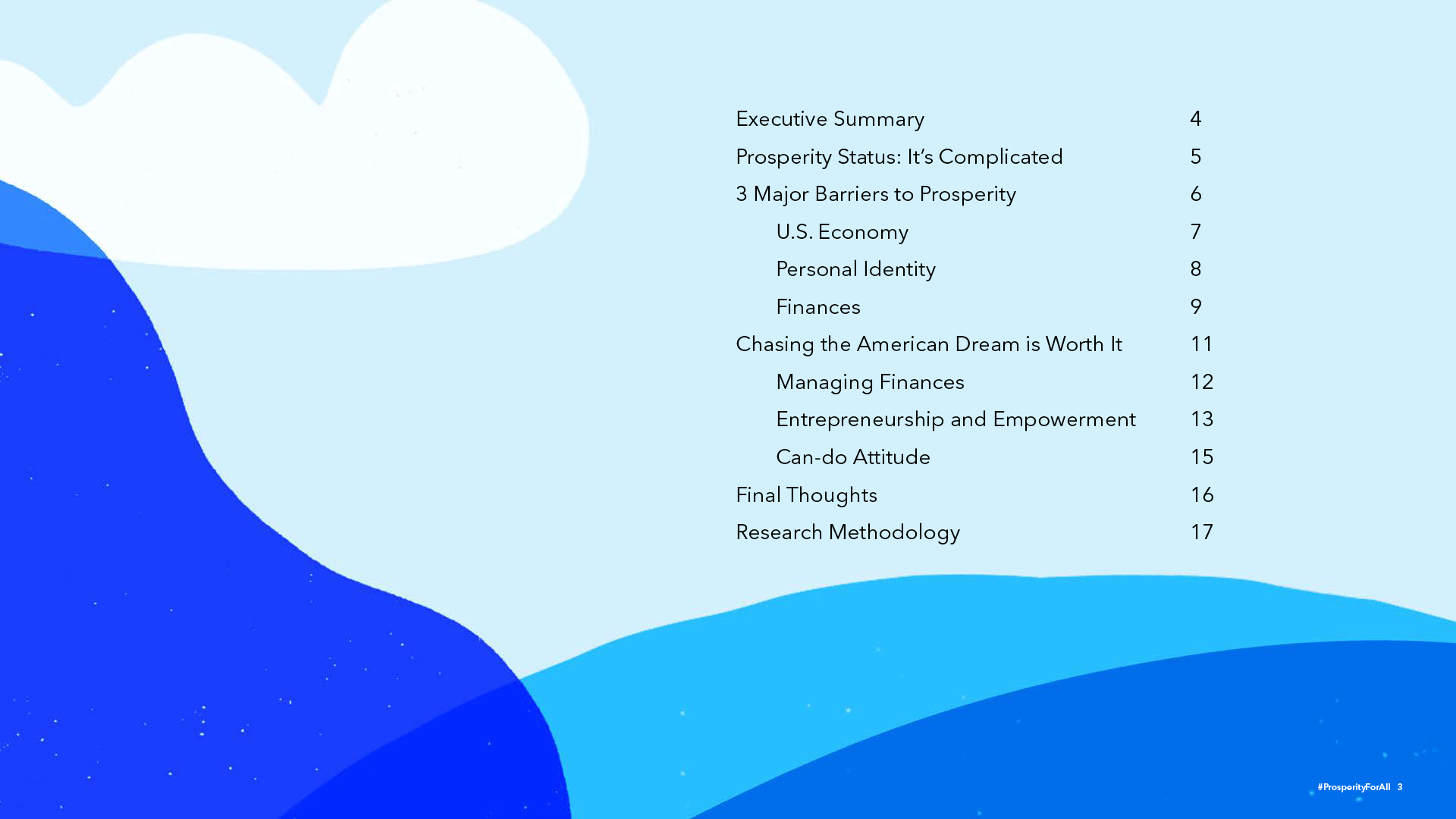
Full Study
Infographic